Jamit – Star of Wonder

jamit

Star of Wonder is a new single from Singapore based (but originally from Melbourne, Australia) artist Jamit. The song draws from a range of electronic musical styles and is characterized by a bright and hypnotically uplifting sound. This track has enough of a pulse to be a party jam but it’s still mellow enough to be enjoyed alone in a moment of meditative reflection. Emotionally, something about it gives off very positive vibes. The synths are very chime-like and cerebral. Star of Wonder is mostly instrumental, although vocals (credited to “Bassa”) occasionally make unexpected appearances to accent the song. Anyway, I came away from this song with a good feeling about Jamit’s music. It has an energy to it and a sense of openness.

For more info:

Star of Wonder by Jamit

Luxury Eviction – Master of None

Luxury_Eviction_cover

Though it was apparently “recorded using legendary audio equipment from Abbey Road and Capitol Records,” Luxury Eviction’s Master of None would have sounded great even recorded on 4-track in someone’s closet. Blair B’s vocals are just that powerful. Her songs could almost be described as avant garde, alternative, and ultimately more substantive versions of James Bond film theme songs like For Your Eyes Only and All Time High. The tracks on this album just have a very epic, symphonic feel to them, but with some edgier, brooding undertones. The songs are very meticulously put together and well crafted. Though they were recorded on top notch (analog?) gear, there isn’t a bunch of processing or post-production tinkering with the sound. It’s mostly left in its fresh and undisturbed form, accented with traditional reverb and delay. My favorite track on this album is probably Dragonflies in Hurricanes, which features some radically retro synths.

For more info:

http://luxuryeviction.com/
http://www.facebook.com/luxuryeviction
https://www.instagram.com/dablairb/

SEDA – Wonderchild

Album cover Wonderchild

A while back I reviewed the lead single for SEDA’s then upcoming EP, Wonderchild. Well, the anticipation is over, and now the full EP has been released. The songs often feature medium paced hypnotic and ambient background music, occasionally spiced up with samples and string synths. The sound has a minimalist vibe, basically singing over light instrumentals, though the tone and nature of the instruments displays some variation over the course of the release. Aside from the opening single, my favorite track on this album is probably Crush, a number which can best be described as what would happen if someone were to combine vaporwave with R&B / pop vocals. Another stand out song is Brave, which pleasantly surprises with bright and poppy guitars. It has a great hook and is the kind of warm and fuzzy track you’d hear during a romantic jewelry commercial.

Wonderchild shows versatility both musically and emotionally. The songs take a humble approach to the subject of love, touching on themes ranging from from initial infatuation and curiosity to regret, perseverance and admiration. SEDA’s dynamic vocals get the job done well enough, but just as importantly the listener comes away with the impression that when SEDA sings these lyrics, he actually means every word of them.

For more info:

https://open.spotify.com/album/2PRgv5LwUJS7ZeRHfxchkd

One Week 20 Years Ago

BARENAKED_LADIES_ONE_WEEK

[Fran and Stephen are observing from the roof of the mall]
Francine Parker: What are they doing? Why do they come here?

Stephen: Some kind of instinct. Memory of what they used to do. This was an important place in their lives.
– Dawn of the Dead (1978)

Hard to believe it’s been 20 years since Barenaked Ladies’ One Week was a popular, chart topping hit. I remember driving around Tempe in the fall of 1998 listening to The Edge 106.3 FM, and it seemed like this song was on the radio every 5 minutes…sometime between songs such as Harvey Danger’s Flagpole Sitta and Third Eye Blind’s How’s It Gonna Be? These songs were heard many times on trips to and from Blockbuster Video (as well as Hollywood Video) to rent and return erotic thrillers, midnight outings to Denny’s, lonely drives to North Phoenix, my job at Abercrombie and all the rest.

One Week was one of those cheesy songs that I would have never admitted to liking but knew the words to and would secretly enjoy when it came on. It wasn’t passionately hated enough for me to like ironically, the way I later did with boy bands and Vitamin C, it was at least preferable to rapcore, a genre which I loathe to this day. In 1998, I would have complained about all the music on the radio sucking except the oldies station. This seems laughable in the context of today, when nearly every pop song is processed gibberish. In hindsight, we didn’t know how good we had it! One Week has the feel of a relic from a much more innocent and carefree era. It might as well be 100 years ago and a different country. The plethora of pop culture references in the lyrics are characteristic of Generation X works made at what Bret Easton Ellis refers to as the “height of the empire.”

Watchin X-Files with no lights on,
We’re dans la maison
I hope the Smoking Man’s in this one
Like Harrison Ford I’m getting Frantic
Like Sting I’m Tantric
Like Snickers, guaranteed to satisfy

I remember thinking these lyrics were so dumb, but not because I was opposed to the idea of cheesy pop culture references in songs. It’s just that the particular items referenced weren’t things that I personally was into. I did after all, write a song about Michael from Melrose Place. To revisit and paraphrase that memorable line from 1978’s Dawn of the Dead, such things had an important place in our lives.

I felt as though I owed it to Barenaked Ladies to write something about One Week, given how much enjoyment this jam gave me in 1998. 20 years later I can finally admit it.

What’s the Score on the Man With the Moon in Taurus?

moon_in_taurus

The shopping. Oh, the shopping.

Guys with this placement LOVE to go shopping. This probably doesn’t sound like a bad thing to some people. Ok, most people. I’m a Capricorn, so I’m practically allergic to mindlessly spending my hard-earned cash on anything that isn’t a necessity.

A guy with a Moon in Taurus wants to shop to achieve a certain ~*aesthetic*~ though. What’s fascinating is that they try to achieve this at the most affordable price, which I kind of admire. This makes sense because Taurus is ruled by Venus, the planet of aesthetics and beauty.

They’re very loyal.

I tend to be flighty because my moon is in Gemini. If you have a similar placement in your chart, then you’ll find a Moon in Taurus a very reassuring presence that anchors you. They love stability and commitment. They’re not prone to erratic behavior.

They love routine.

A guy with this placement enjoys doing the same thing every day.

The same thing. Every day.

If your chart favors this, then you’re in luck. If it doesn’t, then you might find yourself restless and bored at the suggestion to go to the same four places every day. This placement loves the familiar and comfortable, so fire and air signs beware.

The Greatest King of All

greatestofallheroes

The Greatest King of All

By Charles Nunno

A Lost Ark, in a Palace of Cedar, Burning Eternal Flame,
All these things were taught to me,
Passed down, Treasured Names,
I learned of the True Boy who Lived,
The Sheppard who faced A Nimrod,
Hebrew Truth,
Sly Honesty,
A Lizard loving Dragon
Anointed after God’s own heart.

Then I thought.
Am I Saul or Solomon?
A Worse King or a Cursed King?
Did I kill Uriah a hundred times in sleep?
Did I betray the dread Lord of Legend?
Gold and Desire.

A child can kill a Lion,
A son of Jesse can conquer the world,
And build a Pyramid in ever heart,
Make every heart his sword.

Is my soul a wastelast or is it full?
If it is full, is it full for you my Lord?
Enemies are against me.
Where are my weapons?
Can stones speak?
I do not hear them.

Can I win the unwon day,
And make the Sun Stand Still,
Or will I break like the Law at Sinai?
Will I be chained like Samson?
Wailing for Death.

Are there Prophets to help me?
Is there a Dragon to give me half his heart?
Or am I alone, without the greatest King?

 http://www.nunno.group

Grayson Word – All Night

allnight_graysonword

All Night is a follow up single to an EP released earlier this year (at only age 17) by Grayson Word, a “soul/pop singer & multi-instrumentalist based in Nashville.” The verses in All Night delight with a loungy, funky pop sort of quality, but where the track really shines is the chorus. Out of nowhere, Word’s voice casually reaches unexpected highs with considerable ease. This dynamic quality is reminiscent of songs like Billy Joel’s The Stranger. It’s evident from listening to even one Grayson Word track is that this kid is no poser. There are tons of aspiring young pop stars out there with recordings which are gummed up with autotune and horrible effects processing to mask deficiencies in skill. All Night doesn’t have any of that and Grayson’s musical chops are confidently displayed in full force. These recordings cut through the BS that infects much of contemporary pop music. On top of all that, this guy is only a teenager and probably hasn’t even reached his full potential yet. The only thing standing in the way of All Night being played in nearly every department store is a lack of industry connections. Hopefully, that will change as the “Word” gets out.

For more info:

Facebook: https://www.facebook.com/graysonwordmusic/
Spotify: Grayson Word – All Night
iTunes: Grayson Word – All Night

I Dreamed a World and Called It Love

I_dreamed_a_world_and_called_it_love

As I walked toward the museum entrance, my eyes were drawn to a giant red sculpture of what appeared to be a caged tyrannosaurus rex. I found it interesting because it seems like something you would see at the Science Center. It isn’t the kind of highbrow, avant-garde work one expects to see outside an art museum. I briefly entertained the idea of making that piece the focus of this article and avoiding the hefty admission fee ($18 with a student ID) altogether. Ultimately, I decided against it. The museum building itself is constructed in a mid-century modern architectural style, which is fairly common in the downtown Phoenix area and consistent with the age of the building.

The lobby of the museum is a loft-like, large open room with high ceilings. Immediately upon entering, one is greeted to the sight of a 3-D “snowflake” sculpture located near the center of the room. The walls of the hallway adjacent to the lobby are decorated with thousands of black paper butterflies. I’m not sure whether the appearance of the lobby shaped my experience in any significant way, but the open, echoey ambiance and imposing decor gave off the impression that some overwhelming works of art would be in store for my visit.

The galleries are laid out like themed rooms in a multi-level labyrinth maze. The pieces in each gallery tend to fit with the distinct style of each particular collection or exhibition. A gallery will usually feature works from a variety of artists within the particular movement which is being showcased or which the curator specializes in. For example, one of the exhibitions displayed prints by Jasper Johns and Robert Rauschenberg, two iconic “pop” artists who worked together and were involved in a personal relationship with one another for a period of time. I think the galleries are presented this way to organize different styles and emphasize what is unique or distinctive in each of them. It also gives the visitor a more complete exposure and makes the exhibitions themselves seem more thorough. The maze-like floor plan allows the visitor to seemingly “get lost” in all the artwork. It gives guests the opportunity to peer around corners and discover new rooms filled with art, just when they thought they had seen everything the museum had to offer.

Since it was early in the afternoon on a weekday, guests were few and far between during my visit. If I had to guess I would say there were maybe thirty or forty visitors, sparsely spread out in the building. I did notice an elderly couple being chided by an employee for touching a large concrete art installation. I found this mildly amusing, imagining that the couple probably thought the art piece was simply a weirdly decorated bench for them to sit on.

For practical purposes, I had made up my mind ahead of time to select a work of art that was a representational painting that depicted some kind of elaborate scene. Regardless of whether I liked or disliked the piece at all, this would assure that I would have sufficient material to talk about for an entire article without having to resort to over-intellectualizing trivial observations or reaching for contrived meaning. Of course, once I arrived at the museum, that plan went completely out the window, and I ended up selecting a work that I was actually interested in and felt extremely drawn to.

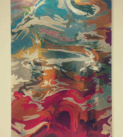
My first impression of Jim Hodges’ I Dreamed a World and Called It Love was that it was shiny and made attractive use of color. From a distance it appeared to be a large, abstract painting which was created utilizing either metallic-colored acrylic paints or perhaps a collage made with colored translucent paper. Upon closer inspection, it appeared to have the consistency of colored tinfoil (is there even such a thing?) or cellophane. Upon reading the label, I discovered that most of my assumptions had been incorrect. The material used for this piece was actually stained glass that was cut and meticulously placed on a thick canvas (Lindsay). I was also grossly errant in assuming this was intended to be a “stand alone” work. It turns out that this is just a single panel in what was originally a larger and much more ambitious installation. The full installation apparently included 38 panels in total. It was exhibited at The Gladstone Gallery in 2016 (“I Dreamed a World and Called It Love”). The mistaken assumption that this was a stand-alone work was significant in this case. Unlike trivial observations like what kind of paint was used or whether the canvas was primed, this actually relates to the content of the work. If a visitor had been presented with the entire installation they might have come away with a completely different reading of the piece. Similarly, if an alternate single panel had been selected from a different section, one which featured a substantially different array of colors, this might provoke alternate interpretations of the overall mood or tone of the work. Some artists might even be annoyed at having their work partially displayed in this manner, but it seems that Jim Hodges has opted to be a good sport.

What’s most notable about this panel of I Dreamed a World and Called It Love is the usage of bright, vibrant color. The colors are not sharply divided but are intricately intertwined like crawling vines. There are solid primary colors, secondary colors, tertiary colors and just about everything in between. Various shades of orange, red and maroon near the bottom give the area a volcanic presence. Turquoise blues, grayish whites and purple globs project an image of partially cloudy skies.

The lines are not rugged or chiseled in their appearance. They seem to flow and curve effortlessly to create soft, peaceful separations for the floating splotches of color. This phenomenon also gives the work a sense of motion, as though we’re visualizing the brain activity of someone in the middle of a dream. If we’re someday able to actually record dreams, I would imagine the earliest successful attempts to do so would produce an image like this (before the technology is perfected.) It’s as if someone freeze-framed a psychedelic animation film at one of the most visually pleasing points.

As I hinted at in my initial impressions, the texture here is shiny and metallic. It reminds me of sheet metal (even though it’s actually glass.) The piece is reflective but not with the same clarity as a mirror. In the museum lighting, reflections are visible, but appear distorted and difficult to make out. It’s similar to seeing one’s reflection in a car window or metal pole. There are also small bubbles visible, which are situated between the glass and the canvas. These bubbles are more likely to be a side effect of the process of attaching the glass to the canvas. I don’t believe they were consciously included as a creative choice. However, these bubbles inadvertently create a sense of physical depth to the work. They contribute to the sense of flotation and are consistent with the dreamlike ambiance of the piece. The bubbles create a liquid or aquatic texture for those fortunate enough to notice them.

I’m inclined to label this piece as non-representational rather than merely abstract. It doesn’t appear to depict any tangible object in the physical world. However, if one looks closely enough (and long enough) at the blobs of color, outlines vaguely resembling animals and human shapes in varying stages of motion can be spotted. I’m almost positive this is just a case of pareidolia though. One can drive themselves bonkers believing they’re seeing faces on Mars or the Virgin Mary in a piece of toast. At the end of the day, one doesn’t need to reach for things that aren’t there in order to recognize the impressive substance in what is plainly visible.

What this work means is anybody’s guess. Other than the title, the artist himself offers few clues. It’s worth noting though that the original gargantuan installation reflected color onto the floor (“I Dreamed a World and Called It Love”). This made the floor an additional part of the artwork. The plethora of different panels allowed visitors to see their reflections in different color combinations. On some level, maybe the artist was trying to help us empathize with all different types of people by having us view so many divergent images of ourselves. These reflections allow us to step into the shoes of others and perhaps into the art itself. Just as the light reflects onto the floor, it illuminates the visitor as well. We become part of the whole of the work.

Besides the fact that I found the color and composition of I Dreamed a World and Called It Love appealing, one of the main reasons I selected this work was that it seemed to stand out among the works by much more famous artists which were hanging nearby. This panel was located in a section of the museum which included paintings by icons like Andy Warhol and Keith Haring. Though Jim Hodges may have received substantial critical acclaim over the years and has probably had an illustrious career, he is by no means a household name. The fact that his panel (which turned out to be only a component of the actual work) managed to outshine (literally in this case) the adjacently displayed artwork of legendary figures made me relate to him as a relative underdog. People will go to the museum specifically just to see Warhol’s soup cans, but maybe someday they will make the trip just so they can see this.

Works Cited:

“I Dreamed a World and Called It Love.” Gladstone Gallery, 2016,
www.gladstonegallery.com/exhibition/11992/installation-view#&panel1-1.
Lindsay, Taylor. “Dozens of Cut-Up Mirrors Get Rearranged into a Magnificent
Glass Room.” Creators, VICE, 29 Dec. 2016,
www.creators.vice.com/en_us/article/9anxy8/cut-up-mirrors-get-rearranged-into-magnificent-glass-room.

Fans of Jimmy Century – eSensuals

esensuals cd art

eSensuals is a full length album from Vegas based (originally from Oakland) duo, “Fans of Jimmy Century” (FOJC for short.) The sound is an impressive combination of loungy female vocals, quirky lyrics and “indiewave” dance music. It’s an eclectic concoction that I’ve personally never heard before, (and I’ve listened to a lot of wild stuff over the years) but which this group performs expertly. There are so many detectable musical trace elements here it would be a struggle to name them all (disco, mod, 80s synthpop, vaporwave etc.) There’s quite a bit of variety among the songs as well. They’re not just doing the same thing over and over on this album. Architecturally, each of these songs has its own personality. True to the album title itself, the tracks on eSensuals are memorable for their clever and catchy names, revealing the wit and creativity of the creators. It’s not all a front or a gimmick though, songs like Liquid Chill and Cherry Drops musically live up to their powerful names in every sense. This album is just a really solid representation of indie music in that it finds the perfect balance between skill, aesthetics, humor, and the avant garde without ever coming across as pretentious or ego-driven.

For more info:

http://fansofjimmycentury.com/

Divine – Runaway

DIVINE

Runaway is the debut single from “Divine,” an up and coming artist from the Philippines. Her mother and sister are both singer’s also, so the passion to perform runs in the family. One listen to Runaway is enough to realize Divine is a talented singer. She sings on key and has a dynamic vocal range. Unlike with other pop artists, the effects in the song are used to accentuate her voice rather than conceal flaws. Take away the beats, the synths and everything else on the recording, and she could still manage to captivate the audience with her vocals alone. She also sings with expressive emotion and a touch of attitude to match the tone of the lyrics. In particular, her rendition of the chorus is where she really shines.

Runaway is a professionally produced pop song of label quality with a video to match. The lyrics center around a love interest whom Divine is advising and pleading with him to run away, so that she won’t have to break his heart. Basically, she has feelings for him but thinks he should stay away for his own mental health. It’s a contemporary spin on a classic romantic theme. I could see this artist rising in popularity if she continues to surround herself with a good team. All of the framework is there. It’s important to mention that Runaway is not officially available yet. It will be available for pre-order on Nov 2nd, and the official release is scheduled for Nov 9th.

For more info:

http://www.iamdivinemusic.com/
http://www.leveledupmusic.com/
https://www.facebook.com/DIANA3GARCIA/
https://www.youtube.com/user/FreeStyle3D